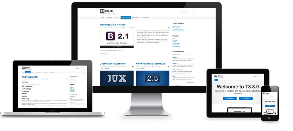
This Joomla template offers is a responsive, mobile friendly, device agnostic template that offers complete control over the look and feel of your website . The template has been created so that it scales effortlessly regardless of the device the user is viewing the web site on. This means that whether your visitors are mobile or stuck to the desk you and your content look good.


Powerful visual tools for determining module layouts.

The new T3 framework offers an unprecedented control over responsive layouts. Giving you the ultimate control over the width and type of modules available on 5 different screen sizes - check out the screenshots below for more.

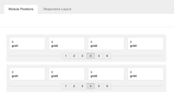
Control the number of modules to use on a single row at the click of a button.

Using the module position layout you can control the number of modules to display in a given row.

responsive1


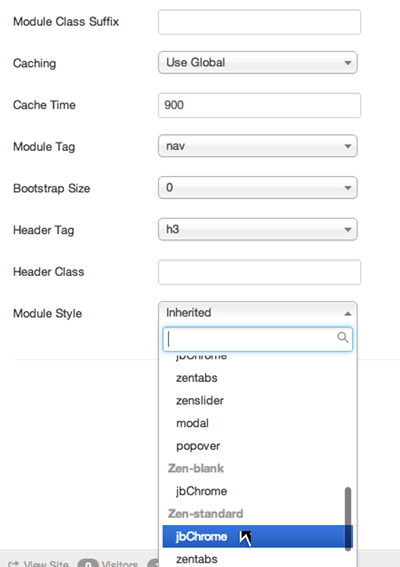
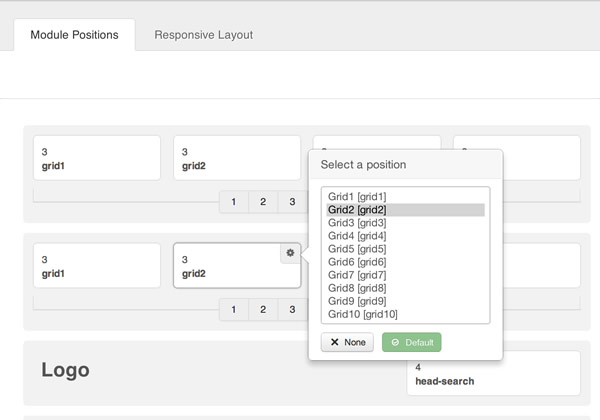
Granular module control

T3 now offers the ability to determine the name of the module you want to use in a particular position. Don't like what we have called an item? then no problem - just change it in the module position are in the template admin.

responsive1a


Control the width and visibility of those modules depending on the screensize.

T3 offers the ability to specify the width and number of modules assigned to a row across a pre-defined number of common screensizes. The screenshot below shows four modules published evenly in the first grid row of modules for wide screen sizes.

responsive2


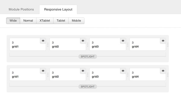
Desktop / Normal Screens

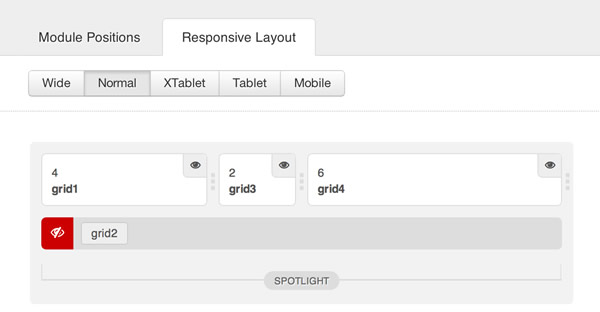
The screenshot below shows the same row with the grid2 module removed and the widths of each module adjusted to create a new layout - this will only be shown on normal / desktop screen sizes.
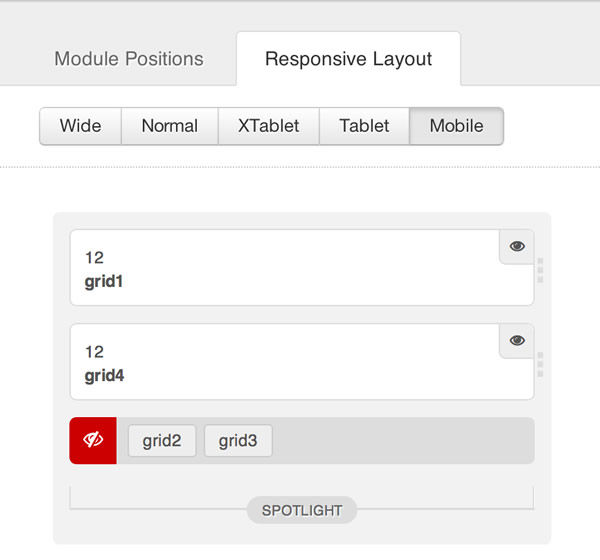
responsive3


Phone sized screens

And finally on mobile screens the grid2 and grid3 positions have been removed and the modules that are left stretch to fill the full width of mobile screens.

responsive4

thememagic1
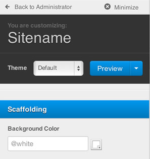
The T3 framework also offers an incredible visual tool for controlling the visible appearance of your site.

It's a LESS driven templating tool that allows you to create template styles on the fly. 

Need to change one of the preset styles but don't want to get your hand dirty? No problem ... just fire up Thememagic, change a colour setting, hit save an then you are done.

This template comes with built in module style / chrome that can be used to implement core Bootstrap component functionality like tabbed layouts, sliders, modal windows and even the pop over display.


Granular control over module style

One of the key features of Joomla 3.0 is the ability to assign modules a specific module chrome.

Prior to Joomal 3.0 each module position was required to have the module style hard coded into the template. There were certain workarounds available for doing this in versions prior to Joomla 3.0 but workarounds to Joomla always come at a cost.


Assigning a new module chrome to a module.

Assigning a new module style to a module is as simple as selecting a style from the drop down list in the module manager.

1. In your module manager edit the moduel you want to assign the new chrome to.

2. Click on the Advanced options tab

3. Scroll down the page and select the module style from the select list.

4. Click apply.

chrome

Module style examples

The following module styles are available in this template.

  • zendefault - A default module chrome
  • zentabs - a tabbed interface
  • zenslider - use the module title to slide open or closed a module
  • zenpopover - Use the module title to display a tooltip / popover with the module content.

zenbase-responsive


This template is built for Joomla 2.5 / Joomla 3.0 on the powerful T3 Joomla template framework.

It's a powerful scaffold to build your next Joomla website on and includes features such as:

  • Complete Bootstrap integration
  • Powerful templating layout tools
  • Easy colour customisation
  • Google font ready
  • Responsive layout and design
  • Multiple module chromes to display modules using the native bootstrap functions such as tabs, sliders, modals and more. 
  • A healthy array of typography and module classes using JB Type and built in styling.


The tabbed module style is a group of modules assigned to the same position and given the zentabs module style in the module settings. The tab triggers are populated by the module title and the tab content is the actual module content.

Demonstration

Click the titles below to view the contents of the module.


Nosotros


Terra Inmuebles, una empresa constituida en el año 2001, cuyo modelo de negocios se basa en la inversión de propiedad horizontal de área corporativa Premium, servicio de arrendamiento puro y de proyectos de llave en mano.

HORARIOS DE ATENCIÓN

Lunes a viernes: 8.00am - 5.00pm

CONTÁCTANOS

PBX (502) 2389 8000
Whatsapp (502) 4654 8825
E-Mail: info@terrainmuebles.net
Dirección: 5ta. Avenida 5-55 Zona 14, Edificio Europlaza, Torre 1, Nivel 17, Oficina 1704, Ciudad de Guatemala.

 
Back to top